
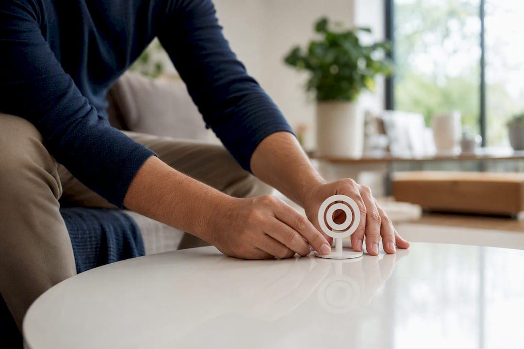
Good hotspot design comes down to one rule: place a few purposeful markers exactly where a visitor's eye lands, and give each one a clear job. Skip the decorative extras. A tour with five well-placed hotspots that guide a decision will always outperform one with fifteen that just look busy.
Here's a checklist to start with today:
- Add no more than 3 to 5 hotspots per scene, and never exceed 10 clickable items on any single stop, per Concept3D's tour benchmarks.
- Set your default icon size around 60 to 80 pixels, with a tap radius large enough for a thumb, not a mouse cursor.
- Place your lead-capture form on the third stop or later, never on the first.
- Write one headline plus a single call-to-action per hotspot. Cut anything longer.
- Preview every hotspot on an actual phone before publishing, not just in the desktop editor.
Pro Tip: Apply the 3-Second Rule: whatever hotspot you want a visitor to notice first should sit inside their natural sightline the moment a scene loads. If they have to hunt for it, you've already lost the click.
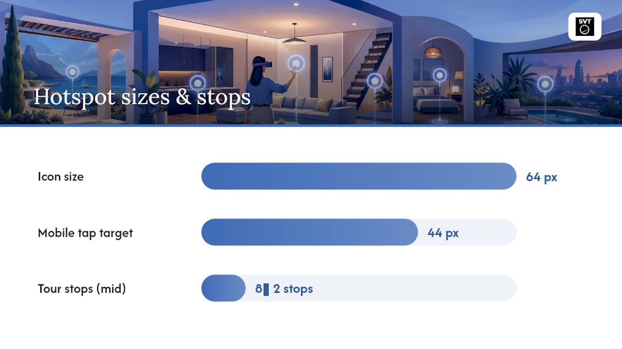
For a quick benchmark to copy into your own settings: aim for hotspot icons around 64px with at least a 44px tap target on mobile, and expect strong tours to run 8 to 10 stops total. Platforms like Simple Virtual Tour build these defaults into their editor, and industry data from Concept3D backs the stop-count recommendation directly.
Key Takeaways
Effective virtual tour hotspot design relies on placing few, purposeful hotspots in the visitor's sightline, sized for mobile, with clear single-action CTAs.
| Point | Details |
|---|---|
| Limit hotspots per scene | Keep 3 to 5 visible hotspots per stop and stay under 10 clickable items total. |
| Apply the 3-Second Rule | Put your most important hotspot where a visitor's eyes land within the first three seconds. |
| Design for mobile first | Size icons around 60 to 80 pixels with tap targets near 44px, since most tour traffic is mobile. |
| Place forms strategically | Add lead-capture forms on the third stop or later, never on the first. |
| Build it in Simple Virtual Tour | The platform's editor supports custom hotspots, media embedding, forms, and analytics for applying these rules directly. |
Table of Contents
- Why Virtual Tour Hotspot Design Drives Engagement
- What Types of Hotspots Should You Use?
- Where and How Many Hotspots Belong on Each Scene?
- How Should Hotspot Icons and Labels Be Designed?
- What Should Go Inside a Hotspot?
- How Should Hotspots Behave on Click or Hover?
- Are Your Hotspots Accessible and Fast-Loading?
- How Do You Test Hotspots Before Publishing?
- What Metrics Show if Your Hotspots Are Working?
- What Hotspot Design Mistakes Should You Avoid?
- How Do You Set Up Hotspots in Simple Virtual Tour?
- Where Simple Virtual Tour Fits Into Your Hotspot Workflow
- Frequently Asked Questions
- Sources
Why Virtual Tour Hotspot Design Drives Engagement
Hotspots are what turn a panorama someone glances at once into an experience they actually explore. Tours that add hotspots, embedded forms, and 360 video see roughly double the average time-on-tour, climbing from about 3 minutes 30 seconds to around 6 minutes. Separately, interactive hotspots have been linked to engagement increases as high as 300% in some reported cases, and roughly 78% of virtual tour traffic now arrives from mobile devices, which is exactly why sizing and testing on phones matters more than desktop polish.
Hotspots earn their place by doing several jobs at once:
- Guiding navigation between rooms or scenes without forcing a visitor to hunt for exits.
- Delivering context (square footage, material specs, historical notes) without cluttering the panorama itself.
- Hosting media, video walkthroughs, photo galleries, audio narration, right where it's relevant.
- Capturing leads through forms placed at the right moment in the journey.
- Triggering conversions: booking a viewing, requesting a quote, adding to cart.
What Types of Hotspots Should You Use?
The right hotspot type maps to what your visitor is likely to do next: move somewhere, learn something, watch something, or take action. Pick the type based on that decision, not on what looks fanciest.
- Link-to-stop: moves the visitor to another scene. Use for doorways, staircases, and any spot where the natural next step is "walk through."
- Text hotspot: short factual callouts. Use for room dimensions, material names, or historical context.
- Image hotspot: a still photo or gallery. Use for close-up detail shots a wide panorama can't capture, like finish quality or texture.
- Video hotspot: short clips. Use for demonstrations, testimonials, or ambient sound that a static image can't convey.
- External link: sends visitors off-tour. Use for menus, brochures, or a booking page.
- Form or e-commerce hotspot: captures contact info or completes a purchase. Use once a visitor has seen enough to be ready to act.
On decision-heavy stops, like a kitchen in a real estate tour or a flagship product display in a retail tour, pair one media hotspot with one CTA hotspot. That combination shows the detail and gives the visitor an obvious next move in the same breath.
Where and How Many Hotspots Belong on Each Scene?
Place your most important hotspot where a visitor's eyes naturally land within the first three seconds of a scene loading. That's the 3-Second Rule, and it exists because attention on a 360 tour drops off fast if nothing grabs it early.
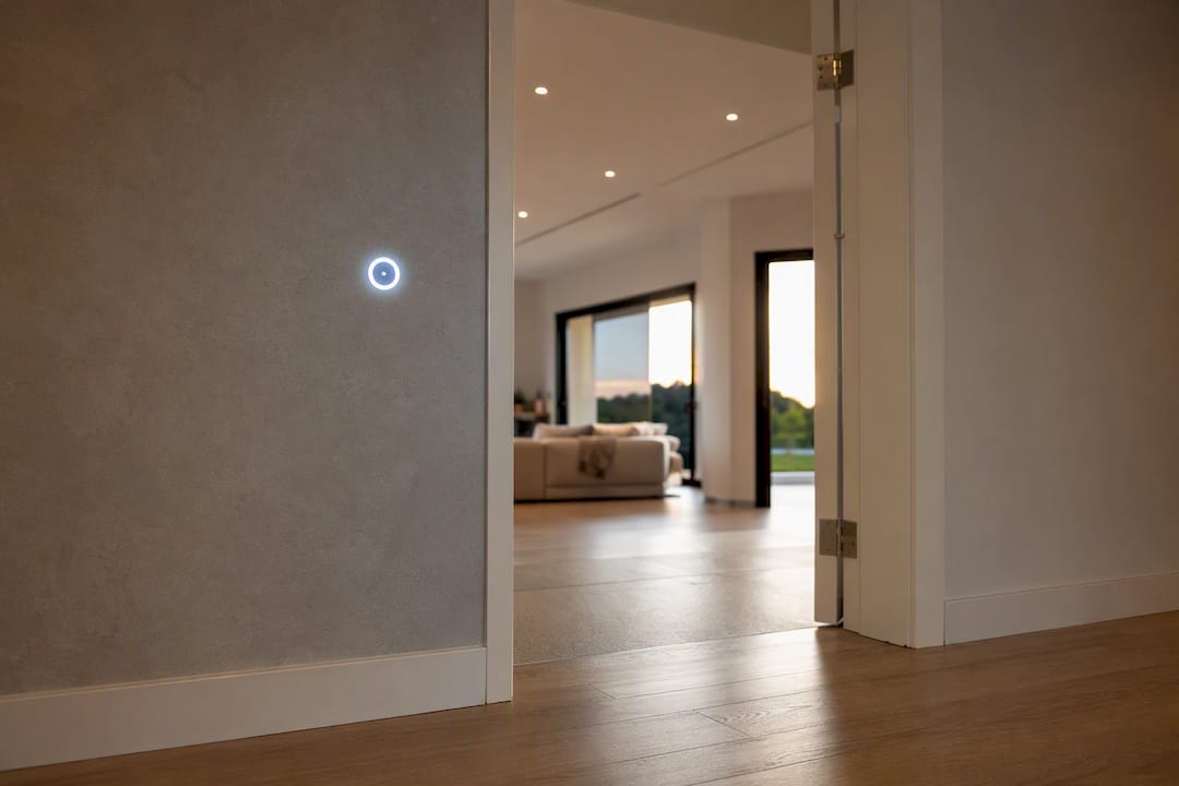
Beyond placement, quantity matters just as much. Concept3D's best-practice guidance recommends staying under 10 clickable items per stop and building tours around 8 to 10 stops total, which keeps engagement time meaningfully above 3 minutes without exhausting the visitor. In practice, most well-designed scenes land closer to 3 to 5 visible hotspots. That's the sweet spot between "enough to be useful" and "too many to process."
Good placement examples include:
- A doorway or hallway opening, for link-to-stop navigation.
- A product display table or countertop, for image or video detail.
- A piece of equipment or fixture, for a text callout on specs or model number.
Pro Tip: Align hotspots to the visual horizon line whenever possible. Markers that float above eye level or sink near the floor get missed far more often than ones sitting where a person would naturally look while standing in the room.
How Should Hotspot Icons and Labels Be Designed?
Consistent, high-contrast icons sized for a thumb, not a mouse, perform best across every device. That single principle solves most of the visual problems creators run into.
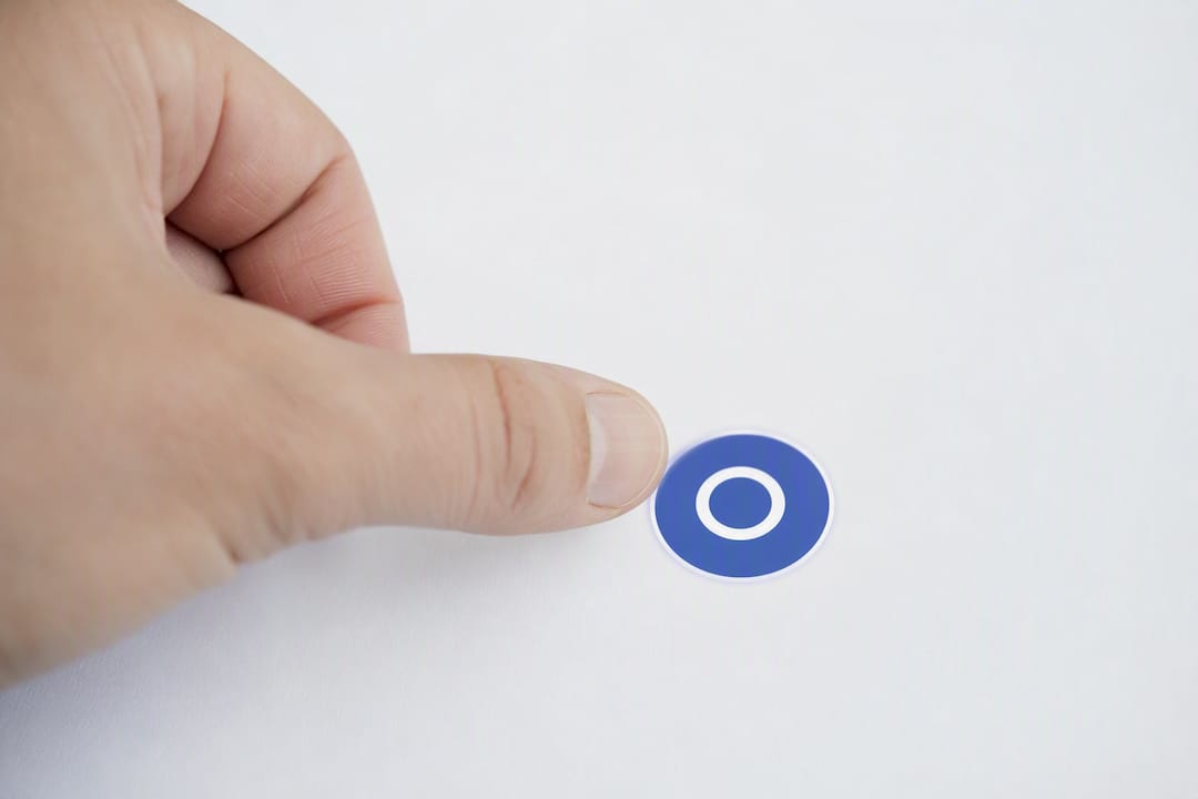
Start with file format. Use PNGs for any custom hotspot graphic, since PNG preserves transparency and lets your icon sit cleanly on top of a panorama without a visible background box. If your icon is tall or oddly proportioned, add transparent padding above or below the artwork. That offsets the visual center point and keeps the icon from looking skewed once it's mapped onto the curved surface of a panorama. For menu-style groupings, several designers combine multiple icon assets into a single PNG and layer invisible, zero-opacity hotspots on top, which simplifies grid alignment considerably.
A few dos and don'ts worth keeping on hand:
- Do use one consistent icon style throughout the entire tour. Mixing flat icons with photorealistic ones reads as unfinished.
- Do choose colors that contrast against the scene behind them while still respecting your brand palette.
- Don't add decorative animations that serve no functional purpose. Tour developers consistently warn against gimmick-heavy design, noting that restraint tends to produce a more professional experience and better conversion outcomes.
- Don't let labels run longer than two or three words. A hotspot label is a signpost, not a sentence.
Three visual patterns come up often. A grouped menu style clusters several small icons near one scene element, useful for a kitchen with separate hotspots for appliances, counters, and lighting. A single prominent CTA style uses one larger, brand-colored icon for the primary action, like "Book a Viewing." A subtle info-only marker style uses a small, low-contrast dot for optional detail that doesn't compete with the main call-to-action.
Restraint isn't the absence of design, it's the discipline to give every visual element a job. If a hotspot doesn't move the visitor toward understanding or action, it's clutter, no matter how nice it looks.
What Should Go Inside a Hotspot?
Concise, action-oriented microcopy paired with fast-loading media wins every time. Never repeat information the panorama already makes obvious. If the visitor can already see it's a marble countertop, don't waste a hotspot restating that fact; use the space for something the image alone can't show.
A simple template works for almost any hotspot:
- Headline: three to five words, naming the subject.
- Body: one to two short sentences with the detail that matters.
- CTA: a single action, "Watch video," "See specs," "Request a quote."
On media, keep it lean. A good default is one video per stop, two to three supporting images, all compressed for web so they don't drag load times. Use video when you're demonstrating movement, sound, or a process, a fireplace lighting, a machine running. Use text or a still image when the goal is quick reference information a visitor will scan in a couple of seconds.
How Should Hotspots Behave on Click or Hover?
Click or tap activation beats hover for one simple reason: hover doesn't exist on a touchscreen, and most of your visitors are on one. Reserve subtle animation for the handful of hotspots you actually want noticed first, like your primary CTA, and keep that animation restrained, a gentle pulse, not a bounce or spin.
A few defaults worth adopting:
- Use a slow pulse (roughly one cycle every 2 to 3 seconds) only on your single most important hotspot per scene.
- Skip animation entirely on secondary, info-only markers so they don't compete for attention.
- For 360 video stops, avoid autoplay with sound and account for buffering time before a hotspot's media becomes interactive.
- When a jump between scenes feels disorienting, insert a hallway or transition image between them, and build two-way navigation links so visitors can retrace their steps naturally.
Are Your Hotspots Accessible and Fast-Loading?
Alt text, a logical keyboard focus order, and ARIA labels on every interactive element are non-negotiable if you want a tour usable by as many visitors as possible. Touch targets need to meet a minimum size too, since a hotspot that's easy to tap on desktop can be nearly impossible to hit on a phone screen.
A short checklist covers most of it:
- Write descriptive alt text for every icon ("Video: kitchen renovation walkthrough," not just "hotspot").
- Confirm keyboard focus moves through hotspots in a sensible order, not randomly around the scene.
- Compress images and host video efficiently rather than embedding oversized files directly.
- Lazy-load hotspot media so scenes render fast even when several hotspots carry video or galleries.
These practices matter even more given that roughly 78% of virtual tour traffic is mobile. A hotspot that loads slowly or requires precise mouse clicks will lose the majority of your audience before they ever see your content.
How Do You Test Hotspots Before Publishing?
Test on the devices your actual visitors use, validate every link and media file, then run a two-minute live walkthrough with someone who has never seen the tour before. That combination catches most problems before they ever reach a client or customer.
- Preview the tour on at least one phone, one tablet, and one desktop browser.
- Click every hotspot and confirm the correct media, link, or form loads.
- Check load times on a standard mobile connection, not just office Wi-Fi.
- Confirm analytics tags are firing on hotspot opens and form submissions.
- Re-run the full checklist after any edit, since a single change can silently break a linked hotspot elsewhere.
A minimal QA checklist to keep on hand covers navigation (do all link-to-stop hotspots land correctly), content accuracy (is every label and caption current), performance (does media load within a couple of seconds), accessibility (does keyboard navigation work), and analytics (are opens and clicks being tracked).
What Metrics Show if Your Hotspots Are Working?
Track hotspot opens, time spent on each stop, and click-through rate to your booking or contact form. Those three numbers tell you almost everything about whether your hotspots are helping people decide, or just sitting there unused.
Metrics worth watching closely:
- Hotspot open rate: which markers get clicked most, and which get ignored entirely.
- Video completion rate: whether visitors watch your media through or abandon it early.
- Link clicks: how often external or e-commerce hotspots get used.
- Form submissions: the real conversion signal for lead-generation tours.
Concept3D's research on tour engagement points to hotspots tied to media and forms as consistently among the most-opened types. If your numbers lag, try small experiments: swap an icon color, reword a CTA from "Learn more" to something specific like "See floor plan," or nudge a hotspot slightly higher in the frame to catch it inside that first three-second glance.
What Hotspot Design Mistakes Should You Avoid?
Most failing tours can be fixed with three moves: remove low-value hotspots, simplify icons, and compress oversized media. Those three changes alone recover the majority of underperforming tours.
Common mistakes to watch for:
- Duplicate information repeated across multiple hotspots in the same scene.
- A lead form placed on the very first stop, before any trust has been built.
- Tap targets too small for a thumb, forcing visitors to zoom in just to click.
- Decorative-only animations that spin or bounce without pointing toward any action.
- Fix duplicate content by consolidating it into one clear hotspot instead of three vague ones.
- Fix early forms by moving lead capture to the third stop or later.
- Fix small tap targets by resizing icons to at least 44px on mobile.
- Fix gimmicky animation by removing it from anything that isn't your primary CTA.
How Do You Set Up Hotspots in Simple Virtual Tour?
Simple Virtual Tour supports customizable hotspots, media embedding, forms, and built-in analytics, so everything covered so far can be implemented directly inside the platform without needing a separate developer.
A typical setup flow looks like this:
- Upload your panorama and confirm it renders correctly in the scene editor.
- Add a hotspot and choose its type: link-to-stop, text, image, video, external link, or form.
- Upload your media asset (PNG icon, video clip, or image gallery).
- Set a single clear CTA label for the hotspot.
- Preview the scene on mobile before publishing.
A few product features map directly onto the practices above: live session hosting for guided walkthroughs, e-commerce integration for hotspots that sell directly, and custom branding so your icons match your existing visual identity. and can round out this section with concrete results once available.
For a deeper, product-specific walkthrough aimed at real estate creators, the hotspot creation guide covers screenshots and step-by-step setup in more detail than fits here.

A Practical Note From Andrea
Every tour I've reviewed that underperformed had the same root problem: too many hotspots competing for the same three seconds of attention. Fewer, higher-value hotspots consistently beat a scene packed with markers. On one project, cutting a scene from eight hotspots down to four raised CTA clicks noticeably, simply because visitors could finally tell which one mattered.
If you take one thing from this, let it be that restraint is a design choice, not a compromise.
Where Simple Virtual Tour Fits Into Your Hotspot Workflow
Once you know the rules, the bottleneck usually isn't knowledge, it's tooling that makes them easy to apply. Simple Virtual Tour builds custom PNG icon support, mobile preview, hotspot-open analytics, and flexible form placement directly into its editor, so the third-stop form rule or the mobile tap-target guidance above isn't something you have to engineer yourself.
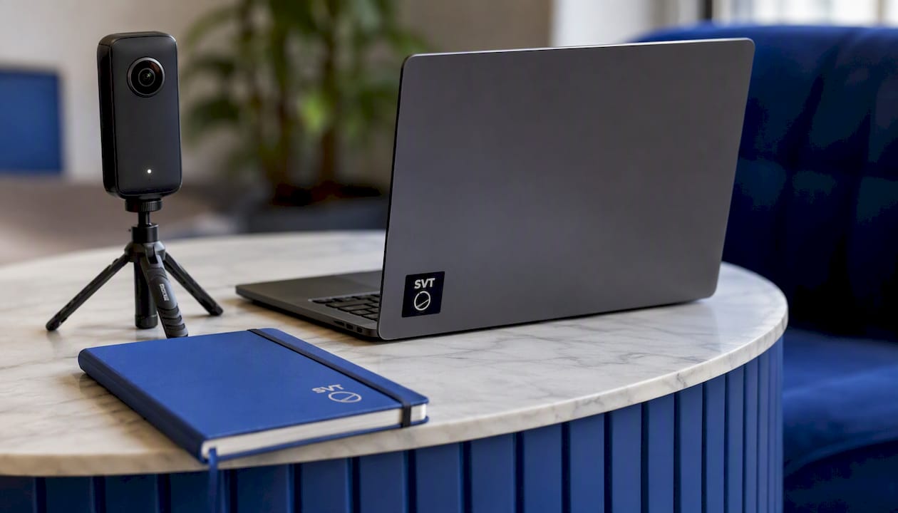
The platform's dual deployment model, cloud-hosted or self-hosted, also means you control where your tour data lives and what your ongoing costs look like, which matters if you're managing a lot of properties or venues at once. Features like live session hosting and e-commerce integration extend hotspot functionality well past static info markers, letting a hotspot sell a product or open a guided walkthrough on the spot. If your CTA hotspots eventually feed into a booking or contact page, pairing them with solid lead-capture form design on the receiving end closes the loop between tour and conversion.
If you're ready to put the checklist from this article into practice, try Simple Virtual Tour and build your first hotspot-driven tour today.
Frequently Asked Questions
What is virtual tour hotspot design? Virtual tour hotspot design is the practice of planning, placing, and styling the clickable markers inside a 360 panorama so visitors can navigate, view media, read details, or take action like booking or buying.
How many hotspots should one scene have? Most well-designed scenes work best with 3 to 5 visible hotspots, and best-practice guidance recommends staying under 10 clickable items per stop regardless of tour type.
Where should I place a lead-capture form in a virtual tour? Place forms on the third stop or later. Asking too early, before a visitor has explored anything, tends to reduce completion rates compared to asking once interest has built.
Should hotspots activate on hover or on click?
What file format works best for custom hotspot icons? PNG is the standard choice because it preserves transparency, letting an icon sit cleanly on a panorama without a visible background box.
Sources
A few resources worth bookmarking as you refine your own tours:
- 360 Tour Best Practices & FAQ – Concept3D Help
- Interactive Hotspots in Virtual Tours: Best Practices Guide
- How to Create a Virtual 360° Tour (Step-by-Step)
- Virtual tourism (insights) — EHL