

Use a short post-tour survey, matched behavioral analytics, and 5 to 8 moderated interviews to find and fix the top UX issues in a single pass. Run a pilot on one or two tours first, targeting roughly 50 survey responses or a device mix that mirrors your real audience. This software gives you a practical way to instrument that pilot without building the tracking yourself.
TL;DR:
- Conduct short post-tour surveys immediately after visits on every tour to maximize response rates and gather immediate recall feedback.
- Use micro-prompts at hotspots or scenes to collect scene-specific diagnostics that reveal precise UX issues beyond general exit surveys.
- Track behavioral metrics such as scene drop-off, hotspot click rates, and replay rates to diagnose whether survey complaints reflect widespread problems.
- Segment data by device and browser to uncover specific usability issues affecting mobile or other platform users, avoiding misleading averaged results.
- Prioritize fixes that improve navigation, interactivity, or clarity based on combined survey scores and analytics, testing major changes on small user groups before full deployment.
Table of Contents
- How Do You Collect Virtual Tour Feedback?
- What Should You Measure in a Virtual Tour Evaluation?
- What Questions Should a Virtual Tour Survey Ask?
- What Analytics Should You Track for Virtual Tour UX?
- Does the Device Someone Uses Change Their Feedback?
- How Do You Turn Feedback Into Actual Fixes?
- How Simple Virtual Tour Supports a Feedback Program Like This
- What I Learned Running Feedback on Tours That Looked Fine on My Screen
- Ready to Put This Feedback Loop to Work?
- Sources
- FAQ
How Do You Collect Virtual Tour Feedback?
Every feedback channel trades breadth for depth, and knowing which trade to make is half the battle. A survey scales to hundreds of visitors but tells you almost nothing about why someone bounced at scene four. A moderated interview tells you exactly why, but you can only run so many before the insights start repeating. The right virtual tour feedback program mixes both, plus a third layer most teams skip: in-tour prompts that catch reactions at the moment they happen, not three days later when the visitor barely remembers the layout.
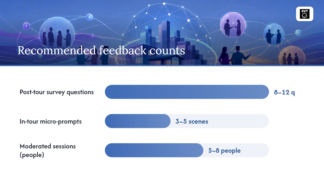
Post-tour surveys work best when they show up right after the visitor exits, not in a follow-up email sent the next morning. Timing matters because recall of specific UX friction (a confusing hotspot, a mini-map that did nothing) decays fast. Keep the survey under 12 questions. Well-designed surveys that mix rating scales with a couple of open-text prompts tend to land response rates of 30 to 40 percent when they are short and appear at the natural end point of the experience. A small incentive (a discount code, an entry into a drawing) can lift that further, though the format matters more than the reward.
In-tour micro-prompts attach directly to a scene or hotspot rather than the whole tour. Instead of asking "How was your experience?" at the end, you ask "Was this label helpful?" the moment someone clicks a hotspot. This gives you scene-level diagnostics you simply cannot get from an exit survey, because visitors rarely remember which specific scene confused them once they have clicked through six more. Pair this with a hotspot design checklist so you are not just collecting complaints but comparing them against known design patterns.
Live guided tours and moderated testing deliver the deepest insight but the smallest sample. Watching five to eight people navigate a tour while narrating what confuses them will surface root causes a thousand-person survey never will, because you can ask a follow-up question the moment someone hesitates. Narrative and live-guided elements also tend to increase place attachment and memory more than visual polish alone, so moderated sessions double as a chance to test whether your narration or story framing is actually landing.
Recruitment shapes everything downstream. If your sample skews toward desktop users on fast connections, you will miss the mobile friction that a third of your real audience experiences daily. Before you launch any feedback round, map your actual visitor traffic by device and browser, then recruit testers or filter survey respondents to match that mix.
A workable channel mix looks like this:
- Post-tour survey on every published tour, always live, 8 to 12 questions
- In-tour micro-prompts on your top 3 to 5 highest-traffic scenes or hotspots
- 5 to 8 moderated sessions per major redesign, recruited to match your real device split
- Optional delayed follow-up (24 to 72 hours later) when the goal is memory or place attachment rather than immediate satisfaction
That last point matters more than it looks. Immediate satisfaction and delayed memory are different measures, and a tour that scores well on exit can still be forgotten within a day if it lacked narrative structure.
What Should You Measure in a Virtual Tour Evaluation?
Four dimensions cover most of what determines whether a virtual tour actually works: navigation, information presentation, proactiveness, and interactivity. This framework comes out of a literature review that built a structured evaluation scale for online museum tours, and it holds up well outside museums too, whether you are running real estate walkthroughs or event venue previews.
Navigation asks whether visitors can find their way without getting lost. Look at path clarity (do arrows and transitions make the next move obvious?), mini-map usefulness (do people actually glance at it, or ignore it?), and location discovery (can a visitor find a specific room or feature without hunting?). A confusing mini-map is not a minor cosmetic issue. It is one of the more common reasons visitors abandon a tour early, and a discussion of mini-map UX patterns from outside the virtual tour space shows the same principle applies broadly: a map only helps if it matches how people actually move through unfamiliar space.
Information presentation covers labeling, contextual media, and narration. Does a hotspot label tell the visitor something useful, or just repeat what they can already see? Does the audio or text narration add context, or feel bolted on? This dimension is where most tours quietly underperform, because teams focus effort on visuals and treat labeling as an afterthought.
Proactiveness measures how well the tour guides a first-time visitor without hand-holding them into boredom. Onboarding steps, pacing suggestions, and gentle nudges ("try clicking here to see the kitchen") fall into this bucket. A tour with zero proactiveness dumps visitors into a scene with no orientation. A tour with too much becomes an obstacle course of forced tutorials.
Interactivity is hotspots, calls to action, and how responsive the whole experience feels. This is not a nice extra. A systematic review of engagement in 360-degree tours found that interactivity and guidance mechanisms like hotspots, mini-maps, and light gamification measurably increase behavioral engagement, and the review recommends standardizing how these get measured across studies. That recommendation applies just as well inside a single organization tracking its own tours over time.
Score each dimension on a simple 1 to 5 scale per tour, then track the scores across your library. A tour that scores low on navigation but high on interactivity has a different fix than one that scores the reverse.
- Navigation: path clarity, mini-map use, location discovery
- Information presentation: label quality, contextual media relevance, narration usefulness
- Proactiveness: onboarding clarity, pacing guidance, unforced discovery
- Interactivity: hotspot responsiveness, call-to-action clarity, perceived responsiveness
Pro Tip: Run the four-dimension scorecard on your best-performing tour and your worst-performing one side by side. The gap between the two usually reveals which single dimension is actually driving engagement for your audience, rather than treating all four as equally important.
What Questions Should a Virtual Tour Survey Ask?
You do not need to write survey questions from scratch. Institutional feedback forms already provide tested wording, and a Penn State Harrisburg virtual tour feedback form is a good real-world example of Likert-scale ratings paired with open-text comments and an invitation to follow up. Adapt that structure to your own four-dimension framework rather than reinventing it.
A workable post-tour survey runs 10 to 12 questions, split across the framework:
- On a scale of 1 to 5, how easy was it to find your way around the tour? (navigation)
- Did the mini-map or navigation controls help you? Yes / No / I didn't notice it (navigation)
- Were you able to find the specific area or feature you were looking for? (navigation)
- Were the labels and descriptions on hotspots clear and useful? (information presentation)
- Did the narration or text add helpful context, or feel unnecessary? (information presentation)
- How would you rate the overall visual and audio quality? (information presentation)
- Did the tour make it clear how to get started? (proactiveness)
- Did the pacing feel rushed, too slow, or about right? (proactiveness)
- How responsive did clicking hotspots or moving between scenes feel? (interactivity)
- On a scale of 0 to 10, how likely are you to recommend this tour to someone else? (NPS)
- What one thing would have made this experience better? (open text)
- What device and browser did you use? (metadata, covered in more depth below)
For in-tour micro-prompts, keep it to one or two targeted questions attached to the specific scene or hotspot, not the whole tour: "Was this information helpful?" with a thumbs up or down, or "What were you expecting to find here?" as an optional open field. These micro-prompts feed directly into scene-level diagnostics that a general survey cannot deliver.
Moderator interview guides need probes that dig past the surface complaint. If someone says a scene was "confusing," do not accept that as the final answer. Ask what they expected to happen when they clicked, where they expected the next transition to lead, and whether anything on screen suggested the correct action. This kind of probing is what turns "confusing" into an actual fix: maybe the hotspot icon does not look clickable, or the transition speed is disorienting rather than the content itself. Also probe for story and sense of place directly, since narrative elements often shape memory more than visual fidelity, and a visitor may not volunteer that a tour felt disconnected unless you ask.
What Analytics Should You Track for Virtual Tour UX?
Self-reported feedback tells you what visitors think happened. Behavioral analytics tell you what actually happened, and the two frequently disagree in useful ways. A visitor might rate navigation as "fine" on a survey while your analytics show they spent 40 seconds stuck in one scene before finding the exit. That gap is where the real diagnostic work happens.
Track these metrics at minimum:
- Time on scene, especially outliers far above or below the average
- Hotspot click rate per scene, to see which interactive elements get ignored
- Full navigation path, to spot where visitors backtrack or loop
- Scene-level drop-off, marking exactly where visitors abandon the tour
- Replay rate, which often signals confusion rather than delight
Tag events with device type, browser, screen size, and connection speed at the point of capture, not after the fact. Retrofitting device metadata onto analytics you already collected is far harder than tagging it from day one, and it is the single most common regret teams report once they start segmenting results.
The real power shows up when you correlate the two data sources. A structured evaluation approach supports splitting users into small cohorts by a single suspected cause, comparing one variable at a time before rolling a fix out widely. If your survey shows a cluster of visitors calling a scene "confusing," check whether that same scene has a low hotspot click rate and a high drop-off rate. If it does, you have converging evidence pointing at a genuine navigation or interactivity problem rather than one frustrated respondent.
| Metric | What It Reveals | Red Flag Threshold |
|---|---|---|
| Time on scene | Engagement or confusion | Far above or below your tour's average |
| Hotspot click rate | Whether interactivity is discovered | Below 10% of scene visitors |
| Scene drop-off | Where visitors abandon the tour | A single scene accounts for a disproportionate share of exits |
| Replay rate | Confusion versus genuine interest | High replay paired with negative survey comments |
This is where the diagnostic loop closes: survey flags a problem, analytics confirms whether it is widespread, and moderated interviews explain the mechanism behind it.
Does the Device Someone Uses Change Their Feedback?
Yes, and the difference is large enough that skipping device segmentation will actively mislead you. A visitor on a phone with one hand free experiences a fundamentally different tour than someone on a desktop with a mouse, and an ignored device split will average those two very different experiences into a single meaningless score.
Add a device and browser question to every feedback form you run, even the short ones. Practitioner guidance is consistent on this point: many UI issues only appear on specific device and browser combinations, and a bug that never shows up in your own testing environment can be the single biggest source of visitor frustration in the wild.
Display mode changes the picture even further. An empirical comparison of desktop versus VR headset viewing found that immersive VR increased presence, engagement, and perceived learning relative to desktop, with usability staying roughly comparable between the two. The same study found VR raised physical-consequence scores, meaning discomfort and fatigue ratings climbed. A tour that feels great on a headset can still generate more complaints about eye strain or motion discomfort than the same tour viewed on a laptop.
Before publishing a tour broadly, run this checklist across contexts:
- Test on at least one low-bandwidth mobile connection, not just office wifi
- Check hotspot and button sizing against real thumb ergonomics, not mouse cursor precision
- Verify resolution and load times on mid-range phones, not just flagship devices
- Confirm captions or text alternatives exist for any audio narration, which also supports accessibility requirements
- If VR is supported, separately track comfort and fatigue ratings, not just satisfaction
A mobile optimization guide is worth reviewing before your next testing round if mobile visitors make up a meaningful share of your traffic, which for most public-facing tours, they do.
How Do You Turn Feedback Into Actual Fixes?
Feedback that sits in a spreadsheet unread is worse than no feedback at all, because it creates the illusion that you are listening. The workflow that actually converts input into shipped improvements has three steps: categorize, prioritize, and test.
- Categorize every piece of feedback by which of the four framework dimensions it touches (navigation, information presentation, proactiveness, interactivity) and assign a severity level: blocking, annoying, or cosmetic. A comment about a broken hotspot link is blocking. A comment about wanting a different color scheme is cosmetic.
- Build a simple impact-versus-effort matrix. Plot each categorized issue on two axes: how many visitors does this affect, and how much work does the fix take? Fixes with high impact and low effort go first, always. High-impact, high-effort fixes get scheduled next. Low-impact issues, regardless of effort, wait.
- Run a small experiment before rolling out any fix widely. Change one variable, publish it to a subset of tours or a limited audience, and measure whether NPS, engagement metrics, or conversion move in the expected direction before you commit to the change everywhere.
Pro Tip: Resist the urge to fix everything from one feedback round at once. Ship the top two or three highest-impact changes, remeasure, and let the data tell you whether the fix actually worked before touching anything else. Bundling five changes together makes it impossible to know which one moved the needle.
This loop is what separates teams that collect virtual tour feedback from teams that improve because of it. The categorization step alone often surfaces a pattern you would have missed: three seemingly unrelated complaints turning out to be the same underlying navigation issue described three different ways.
How Simple Virtual Tour Supports a Feedback Program Like This
The software was built with the instrumentation this kind of feedback program actually requires, not bolted on after the fact. Live session capabilities let you run moderated walkthroughs directly inside the platform, so the interview step described earlier does not require a separate screen-sharing tool or a workaround. Analytics and event tagging track scene time, hotspot engagement, and navigation paths natively, which is the behavioral half of the diagnostic loop this guide has walked through.
Because the platform offers both cloud-hosted and self-hosted deployment, teams that need tighter control over visitor data (museums working with donor information, real estate firms with client privacy commitments) can run the entire feedback pipeline, survey responses, analytics events, and interview recordings, on infrastructure they control. That matters more than it might seem once you are correlating device metadata with individual response patterns.
The multilingual UI also solves a quieter problem: international visitors giving feedback in their own language often surface issues that English-only respondents miss entirely, particularly around narration and labeling clarity.
A practical pilot to run in your first week:
- Pick one existing tour and enable event tagging for time on scene, hotspot clicks, and drop-off
- Publish a short post-tour survey using the 10 to 12 question structure outlined earlier
- Recruit 5 to 8 people across your real device mix for moderated sessions
- Compare survey scores against the four-dimension framework before deciding what to fix first
What I Learned Running Feedback on Tours That Looked Fine on My Screen
The device-segmentation lesson tends to hit hardest the first time it happens to you. A tour that scored well in every internal review looked fine on every laptop in the office, and then a round of mobile-specific feedback showed a hotspot that nobody could actually tap with a thumb. It was not a design failure exactly. It was a testing failure: nobody had tested it the way most real visitors actually experience it.
The metric I keep coming back to as underrated is replay rate. Most teams treat a high replay rate as a compliment, assuming visitors loved the tour so much they watched it again. Sometimes that is true. More often, a high replay rate paired with lukewarm survey scores means someone got lost and was trying to find something they missed the first time. Context is everything, and replay rate without a matching survey comment tells you almost nothing on its own.
The broader lesson is speed. Ship a small fix, remeasure within a week, and move to the next issue. Waiting for a perfect, comprehensive redesign before testing anything is how good ideas die on a roadmap instead of improving a real tour.
— Andrea
Ready to Put This Feedback Loop to Work?
Most feedback tools force a choice: use a survey platform bolted onto your tour software, or accept whatever basic analytics your hosting provider gives you and hope it is enough. Simple Virtual Tour skips that trade-off by building live sessions, event tagging, and survey-ready analytics into the same platform where you build and publish the tour itself, so the diagnostic loop this guide describes does not require stitching together three separate tools.
If you manage tours for real estate listings, a museum collection, or an event venue, the fastest way to see whether this feedback approach fits your workflow is to run it on one tour. Instrument scene-level analytics, publish a short post-tour survey, and schedule a handful of moderated sessions with visitors who match your real device mix. You can try Simple Virtual Tour and start that pilot on your very next published tour.
Sources
The Forbidden City museum tour evaluation is the source for the four-dimension framework used throughout this guide, useful if you want the original academic scale. The Penn State Harrisburg feedback form offers a copyable real-world survey template. The 360-degree tour engagement review is worth reading for the case behind prioritizing interactivity fixes. The immersion and display-mode study explains the VR-versus-desktop comfort tradeoff in more depth. The narrative and memory research backs the case for probing story and place attachment, not just satisfaction.
- Evaluation of virtual tour in an online museum: Exhibition of Architecture of the Forbidden City
- Turning Heads: Quantifying Hedonic, Eudaimonic, and Behavioural Engagement in 360° Tours
- Virtual Voyages: Evaluating the role of real-time and narrated virtual tours in shaping user experience and memories
FAQ
Are Virtual Tours Worth the Investment?
Virtual tours pay off when paired with real feedback loops rather than published and forgotten. Tours that get iterated on using survey, analytics, and interview data tend to show measurably better engagement than tours that never get revisited after launch.
What Is the Best Way to Collect Virtual Tour Feedback?
A mix of a short post-tour survey, in-tour micro-prompts on high-traffic hotspots, and 5 to 8 moderated interviews per redesign covers both breadth and depth. Platforms like Simple Virtual Tour let you run the live session and analytics pieces without separate tools.
What Are the Downsides of Virtual Tours Compared to In-Person Visits?
Virtual tours can raise discomfort or fatigue scores when viewed in VR, and desktop viewers may miss some of the presence and immersion that in-person visits or headset viewing provide. They also depend heavily on device and connection quality, which in-person visits do not.
How Do You Know if Your Virtual Tour Navigation Is Confusing?
Cross-check survey ratings on wayfinding against behavioral analytics like scene drop-off and navigation path loops. If visitors rate navigation poorly and your analytics show repeated backtracking at the same scene, that scene needs a fix.
What Metrics Matter Most for Evaluating Virtual Tour Quality?
Navigation, information presentation, proactiveness, and interactivity form a research-backed framework for scoring virtual tour quality, supported by hotspot click rate, time on scene, and drop-off as the behavioral metrics that validate self-reported scores.