

Custom CSS lets you restyle either the public Viewer or the Backend dashboard of a virtual tour, changing colors, fonts, and layout to match your brand. Open Settings → Custom CSS / JS Headers in your tour platform, or add scoped CSS to the page hosting the embed. If you're working with an iframe, confirm whether it needs a URL parameter to activate your custom styles before anything else.
TL;DR:
- Custom CSS should target stable attributes like data-* or container classes to avoid breaking after vendor platform updates.
- Hiding toolbar buttons visually without removing keyboard focus requires offscreen clipping, not display: none, to maintain accessibility.
- Loading custom fonts before the viewer renders prevents flashes of unstyled text, ensuring consistent branding.
- Always test custom styles on staging environments across devices and keep versioned backups to facilitate safe rollbacks.
- Use :focus-visible for focus indicators to preserve keyboard accessibility and comply with WCAG success criteria.
Table of Contents
- Custom CSS Virtual Tours: Ready-to-Use Code Snippets
- How Do You Target Elements That Won't Break on Update?
- Does Custom CSS Break Accessibility for Keyboard Users?
- Testing and Rolling Back Custom CSS Safely
- Where Simple Virtual Tour Fits Into This Workflow
- Integrating CSS Customizations With Popular Tour Platforms
- When Should You Use Theme Settings Instead of Full CSS?
- Try Custom CSS on Your Own Virtual Tour Today
- A Different Take on "Set It and Forget It" Styling
- Sources
- FAQ
Custom CSS Virtual Tours: Ready-to-Use Code Snippets
Most branding requests boil down to four things: colors, fonts, hidden buttons, and a viewer that resizes properly on every screen. Here's how to handle each one without touching vendor code you don't control.
Start with brand tokens. Instead of scattering hex codes through your stylesheet, define them once as CSS variables, then override the viewer's own tokens if it exposes any:
:root {
  --svt-brand-primary: #1c3d5a;
  --svt-brand-accent: #e8a33d;
  --svt-font-body: "Inter", sans-serif;
}
[data-svt-viewer] .toolbar {
  background-color: var(--svt-brand-primary);
  font-family: var(--svt-font-body);
}
Hiding a toolbar button is the single most requested tweak, and it's also where most people accidentally break keyboard access. Never use display: none on an interactive control if you still want it reachable by keyboard or screen reader. If the button needs to be hidden for everyone, hiding it outright is acceptable. For cases where you want it visually hidden but still accessible, use offscreen clipping instead:
[data-svt-viewer] .btn-fullscreen {
  position: absolute;
  width: 1px;
  height: 1px;
  overflow: hidden;
  clip-path: inset([50%](https://developer.mozilla.org/en-US/docs/Web/CSS/Reference/Properties/clip-path));
}
For responsive sizing, the modern approach uses the CSS frame-sizing property, which lets an embedded document opt into sharing its layout size with the parent iframe. Where the platform doesn't support that opt-in yet, fall back to a padding-based responsive box:
.svt-embed-wrap {
  position: relative;
  width: 100%;
  padding-bottom: 56.25%;
}
.svt-embed-wrap iframe {
  position: absolute;
  top: 0; left: 0;
  width: 100%;
  height: 100%;
  border: 0;
}
Font swaps need one extra step people skip: loading the font before the viewer paints, or you'll get a flash of the default typeface.
| Snippet | Paste location | Compatibility notes |
|---|---|---|
| Brand color variables | Viewer custom CSS | Works if viewer exposes CSS custom properties |
| Hide toolbar button | Viewer custom CSS | Use offscreen clipping, not display:none, to preserve keyboard access |
| Custom font import | Page <head>, before viewer script | Load font first to avoid flash of unstyled text |
| Responsive iframe wrapper | Embedding page CSS | Padding fallback works everywhere; frame-sizing where supported |
Each of these snippets is small on purpose. Small overrides are easier to audit when something looks wrong after an update, and they're the difference between a five-minute fix and a rebuild.
How Do You Target Elements That Won't Break on Update?
Vendor platforms frequently regenerate hashed class names during builds, something like .css-4f8x2a today and .css-9k1p7z next release. Any rule you write against that exact string dies the moment the platform ships a new build. Target stable attributes instead.
- Prefer
data-*attributes and wildcard selectors like[class*="toolbar"]over exact hashed class names. - Scope every rule to a container attribute such as
[data-svt-viewer]or[data-pp-embed]so your CSS never leaks into the rest of the page. - Layer only the overrides you actually need. Copying an entire vendor stylesheet into your custom CSS file guarantees a fight with every future platform update.
- For iframe embeds, check whether the embedded document exposes a
requestResizecall or similar API so it can proactively tell the parent frame its real height, rather than you guessing at a fixed pixel value.
Pro Tip: Keep a running comment header at the top of your custom CSS file listing the date and platform version you tested against. When a tour looks off after a vendor update, that timestamp tells you in five seconds whether the update is the likely cause.
This layering habit matters more than any individual snippet. A tour built to communicate venue ambiance through deliberate color and lighting choices only stays consistent if the underlying selectors survive contact with a platform release.

Does Custom CSS Break Accessibility for Keyboard Users?
It can, and this is where most self-styled tours quietly fail their keyboard and screen reader visitors. Removing a focus outline for aesthetic reasons is the single most common accessibility mistake in custom tour styling.
Use :focus-visible instead of stripping outlines wholesale. W3C technique C45 recommends exactly this pattern: keyboard users get a visible indicator, mouse users don't see an outline on every click.
[data-svt-viewer] button:focus-visible {
  outline: 3px solid var(--svt-brand-accent);
  outline-offset: 2px;
}
The W3C's own guidance on focus visibility is blunt about the failure mode: removing focus indication without replacing it fails Success Criterion 2.4.7, full stop.
- Respect
@media (prefers-reduced-motion: reduce)for autorotate and transition animations. MDN's guidance covers exactly this pattern, and it matters because autorotate can trigger vestibular discomfort in sensitive users. - Check contrast ratios on any brand accent color you apply to buttons or hotspots, not just body text.
- Run a keyboard-only pass after every CSS change: Tab through the toolbar, hotspots, and menu, confirming nothing goes invisible or unreachable.
Accessibility check: Web accessibility failures aren't rare edge cases. Poor accessibility practices routinely correlate with weaker SEO performance and higher bounce rates, which makes focus-visible styling a business decision, not just a compliance box.
Testing and Rolling Back Custom CSS Safely
Never push new CSS straight to a live, published tour. A staging embed or preview editor catches breakage before a client sees it.
- Publish your changes to a staging embed or preview link first, using a URL parameter to enable the custom CSS if your platform supports it.
- Test both desktop and mobile breakpoints, then tab through hotspots and menus to confirm keyboard navigation still works.
- Avoid universal selectors (
*) and deeply nested chains. Overly specific selectors slow down style recalculation, and that lag is far more visible on a low-end phone than a development laptop. - Keep versioned copies of each CSS file, and build in a quick toggle, like a single class on the
<body>, that disables your custom styles instantly if something breaks.
Pro Tip: Name your CSS files by date, not by version number alone: "svt-custom-2026-03-14.css" tells you at a glance what was live when a client reported an issue.
This kind of staged rollout pairs well with a broader performance optimization pass, since bloated CSS and unoptimized panoramas tend to show up as the same complaint: a tour that feels sluggish on mobile.
Where Simple Virtual Tour Fits Into This Workflow
Simple Virtual Tour's own documentation walks through exactly this Viewer versus Backend distinction. Its Custom CSS / JS tutorial shows how to open Settings → Custom CSS / JS Headers and choose whether your code targets the public-facing Viewer, the admin Backend, or both, with room for custom head elements when you need more than styling alone.
Deployment choice matters here too. If you're layering heavy custom CSS and want full control over caching and update timing, self-hosting removes the guesswork of a shared cloud environment. If you'd rather skip server management entirely, cloud hosting keeps updates automatic.
- Settings → Custom CSS / JS Headers separates Viewer styling from Backend styling, so client-facing branding never touches your admin dashboard by accident.
- Cloud-hosted and self-hosted deployments both support the same custom CSS workflow, the difference is who manages the server and update timing.
- The tutorials hub covers embedding patterns that pair naturally with the CSS techniques above.
Integrating CSS Customizations With Popular Tour Platforms
Every virtual tour platform draws its CSS hooks a little differently, and knowing the pattern before you start saves an hour of trial and error. Hosted SaaS viewers, the kind most real estate and tourism teams use, typically expose a dedicated custom CSS field in their settings panel, scoped automatically to the viewer's container. That's the safest entry point because the platform handles the wrapping selector for you.
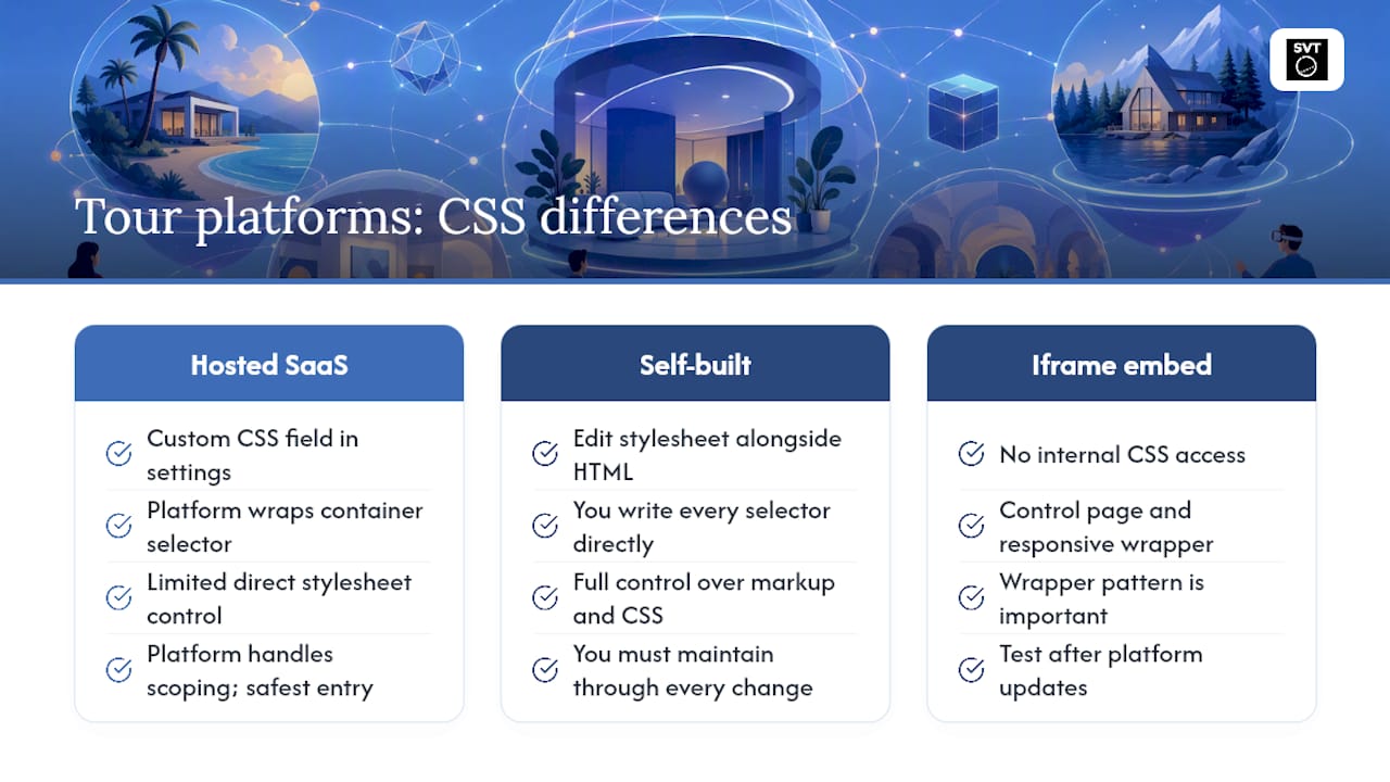
Self-built viewers, often assembled on frameworks like Marzipano through vanilla JavaScript, work differently. There's no settings field to fill in. Instead, you're editing a style.css file directly alongside the HTML markup, which gives you full control over every selector but also full responsibility for maintaining it through every future change you make yourself.
Embedded iframe integrations sit in between. You don't control the tour platform's internal CSS, but you fully control the page around the iframe, which is why the responsive wrapper pattern from earlier in this guide matters so much for that setup specifically. Whatever platform you're on, the same rule holds: scope your rules tightly, avoid full stylesheet overrides, and test after every platform update rather than assuming your CSS survived it.
When Should You Use Theme Settings Instead of Full CSS?
Small branding jobs, a color, a font, a logo swap, belong in theme variables or a handful of scoped CSS rules. Save full CSS skinning for cases where you genuinely need long-term control, and lean toward self-hosting if that's the plan. Heavy customization that strips out focus states or depends on brittle, hashed selectors will cost you more in maintenance than it saves in polish.
Try Custom CSS on Your Own Virtual Tour Today
Simple Virtual Tour is built around exactly the workflow this guide walks through: targeted Custom CSS / JS Headers that let you style the Viewer and Backend separately, plus the choice between cloud hosting and self-hosting depending on how much data control and long-term customization you want.
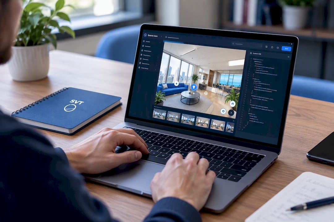
Unlike platforms that lock branding behind rigid templates, Simple Virtual Tour gives you direct access to the same Settings → Custom CSS / JS Headers panel referenced throughout this guide, so the snippets above aren't theoretical. Self-hosted users pay a one-time purchase price for the software, avoiding ongoing subscription fees. If you're just getting started, the Free Forever plan costs nothing to try and lets you experiment with custom CSS before committing to a paid tier like XS Starter at €2.99 per month. When you're ready to move a real project forward, you can set up your account and start applying the branding techniques covered here on a live tour. Support docs and tutorials are available directly on the site if you get stuck along the way.
A Different Take on "Set It and Forget It" Styling
Most guides treat custom CSS as a one-time decoration job: paste the snippet, admire the new colors, move on. That mindset is exactly what causes tours to break silently six months later. The platform ships an update, a hashed class name shifts, and nobody notices until a client points out that the toolbar looks wrong.
The better mental model treats custom CSS the way developers treat any dependency: something that needs versioning, a changelog, and a rollback plan, not a fire-and-forget decoration. That's a bigger mindset shift for marketers than for developers, since most branding work elsewhere doesn't demand ongoing maintenance the way an override layer sitting on top of someone else's platform does.
There's also a quieter tension worth naming: the accessibility corners people cut in custom CSS are almost never intentional. Nobody sets out to make a tour unusable for keyboard visitors. It happens because outline: none looks cleaner in a screenshot, and screenshots are what get approved. Treating :focus-visible as a default habit, not an afterthought you bolt on after a complaint, is the only fix that actually holds up.
— Andrea
FAQ
Can I create my own virtual tour with custom styling?
Yes. Most modern tour platforms, including Simple Virtual Tour, include a Custom CSS / JS field in settings that lets you restyle the Viewer or Backend without writing a full standalone site. If you want complete control over every selector, a self-hosted or framework-based build works too, but it requires ongoing CSS maintenance yourself.
What is the best free option for building a virtual tour?
Simple Virtual Tour's Free Forever plan lets you build and publish tours with no listed cost, making it a practical starting point before committing to a paid tier. Framework-based options like Marzipano are also free but require you to write and maintain your own viewer code.
Is there an AI tool that builds a virtual tour for me?
AI multimedia editing tools can speed up parts of tour production, like image enhancement or panorama stitching, but a fully automated end-to-end tour builder isn't standard yet. Platforms combining AI editing plugins with manual scene setup, which Simple Virtual Tour offers through its A.I. Tools Plugin, currently represent the closest practical option.
Will custom CSS break after a platform update?
It can, especially if your rules target hashed vendor class names that regenerate on each release. Scoping your CSS to stable data-* attributes and layering only the overrides you need, rather than pasting an entire vendor stylesheet, makes your styling far more likely to survive an update intact.
Does adding custom CSS affect keyboard accessibility?
It can if you remove focus outlines without replacing them, which is a common but avoidable mistake. Using :focus-visible as described in W3C's C45 technique keeps keyboard focus indication intact while still letting you control the visual style.