
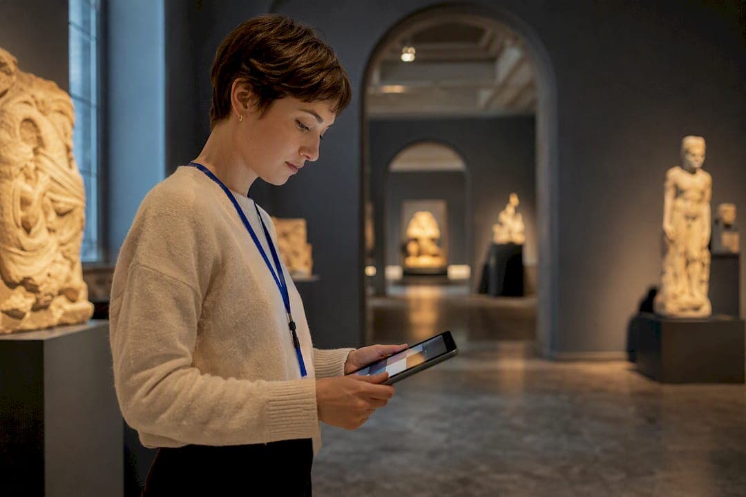
A hotspot is a clickable point inside a 360° scene that reveals information, media, or a link to another location. The single rule that matters most: place your most valuable hotspots inside the viewer's initial field of view, and cap each scene at three to five total. Everything else, from icon color to copy length, is secondary to those two decisions. Below you'll find the types, placement logic, content templates, and a technical checklist to build tours that actually get explored.
TL;DR:
- Position the most critical hotspot inside the initial view during the first three seconds to maximize immediate engagement.
- Limit hotspots to three to five per scene, prioritizing strategic placement over quantity to avoid overwhelming viewers.
- Place navigation hotspots where viewers are likely to look next and ensure they are two-way, seamless, and natural.
- Keep hotspot copy concise, using simple labels and relevant facts, with media optimized for fast loading and accessibility.
- Test hotspots across all devices and browsers, measure their performance, and refine placement, content, and design based on real viewer data.
Table of Contents
- What Are the Main Types of Virtual Tour Hotspots?
- Where Should You Place Hotspots for Maximum Engagement?
- How Do You Write Hotspot Copy People Actually Read?
- How Do You Technically Set Up and Test Hotspot Links?
- What Do Effective Hotspot Templates Look Like by Industry?
- What Should You Track to Improve Hotspot Performance?
- How Does Andrea's Approach to Hotspot Design Hold Up?
- What Mistakes Do Most Creators Make With Hotspots?
- Where Does Simple Virtual Tour Fit Into This Checklist?
- Sources
What Are the Main Types of Virtual Tour Hotspots?
Every hotspot you place should do one of five jobs: inform, guide, show, sell, or delight. Confusing these roles is the fastest way to end up with a scene full of icons nobody clicks.
Information hotspots answer a question the viewer is already asking silently, like "what's that fixture?" or "how old is this building?" They work best as short text pop-ups, and you should skip them entirely when the answer is already visible in the scene. A caption on an obvious kitchen island is wasted real estate.
Navigation hotspots move the viewer between panoramas, acting as doors between rooms or locations. Effective virtual tours use navigation hotspots as connective tissue between scenes, and they need to feel like a natural next step, not a puzzle.
Media hotspots open a photo, video, or audio clip, giving depth without cluttering the main panorama. A real estate tour might use one to show a floor plan sketch; a museum tour might use one to play a curator's narration.
Action or contact hotspots push the viewer toward a conversion moment, booking a viewing, requesting a quote, or adding a product to a cart.
Playful hotspots add personality, like an Easter egg in a hotel tour or a mascot in a retail space, and they should be used sparingly since they carry no functional weight.
- Information: use for context that isn't visually obvious
- Navigation: use to connect every explorable scene, always two-way
- Media: use for depth (video, audio, high-res detail) without crowding the scene
- Action/contact: use at the exact moment a viewer would want to act, like standing in a kitchen they love
- Playful: use once, if at all, and never at the expense of function
Where Should You Place Hotspots for Maximum Engagement?
Viewers scan a panorama in predictable sight-lines the moment it loads, and they tend to ignore anything sitting outside their first three seconds of attention. That's the 3-second rule, and it's the reason a beautifully designed hotspot can still go unclicked: it's simply not where the eye lands first.
Your most important hotspot in any scene, whether it's a navigation point or a booking CTA, needs to sit inside that initial field of view. Everything else can wait for the viewer to look around.
On density, three to five hotspots per scene tends to provide optimal engagement. Fewer than three often leaves value on the table; more than five starts to overwhelm, and interactive hotspots only increase engagement when placement is strategic and restrained rather than exhaustive.
- Identify the one action or fact every viewer of this scene needs, and place that hotspot first, inside the initial view.
- Add navigation hotspots next, positioned where a real visitor would naturally walk or turn.
- Layer in one or two media or information hotspots only where they add something the scene doesn't already show.
- Test the scene on a phone screen before finalizing placement, since thumbs miss small targets that a mouse cursor never would.
Progressive disclosure helps here too: starting with a light informational hotspot and revealing richer media only after a click reduces cognitive load and keeps first impressions clean. Think of it as a two-step reveal rather than dumping everything at once.
On mobile, touch targets need real breathing room. A hotspot that looks fine on a 27-inch monitor can be nearly impossible to tap accurately on a 6-inch screen, so build with the smaller device first and let the desktop version inherit those safer proportions.
Pro Tip: Stand in the scene as if you were the visitor and ask what you'd want to know within three seconds of arriving. That's your first hotspot. Everything else is negotiable.
How Do You Write Hotspot Copy People Actually Read?
Hotspot text competes with the panorama itself for attention, so it has to earn its place in under a sentence. "Renovated in 2023" works. "This kitchen underwent a full renovation in 2023 featuring new quartz countertops" does not, because nobody reads a paragraph inside a floating bubble.
A few copy templates that hold up across industries:
- Information: "[Feature] + [one relevant fact]" — "Skylight, added 2022."
- Navigation: a verb plus a destination — "Enter Living Room," "Go to Rooftop."
- Media: a plain label over a play icon — "Watch: Chef's Kitchen Tour."
- Action/contact: an unambiguous verb — "Book a Viewing," "Get a Quote," "Add to Cart."
Media sizing matters as much as wording. Oversized images or unoptimized video inside a hotspot slow the whole scene down, and a slow hotspot is a hotspot nobody waits for. Compress photos before upload and keep embedded video short, ideally under a minute, with a lightweight preview frame rather than autoplay.
Accessibility deserves the same rigor as design. Every media hotspot needs alt text describing what it shows, not just for compliance but because it helps the software describe the scene to viewers using screen readers. Hotspots should be reachable by keyboard focus, not just mouse or touch, and every pop-up needs an obvious close control, ideally an X in a consistent corner, since a trapped viewer is a lost viewer.
Icon consistency ties the whole experience together. Pick one shape language, one color for navigation, another for information, and stick with it across every scene so viewers build a mental map of what each icon means before they've even clicked it. That consistency, paired with your hotspot design checklist, keeps branding coherent without slowing anyone down.
How Do You Technically Set Up and Test Hotspot Links?
Getting the design right is only half the job. The other half is making sure hotspots load fast, connect correctly, and hold up across devices.
- Create each navigation hotspot by clicking the exact point in the panorama where the viewer should move, then link it to the destination scene. Most modern platforms follow a straightforward point-and-click workflow for this step.
- Build the return link immediately. Two-way navigation between scenes prevents the disoriented, "how do I get back?" feeling that makes viewers abandon a tour.
- Connect your scenes to a floorplan or mini-map wherever the tour has more than a handful of rooms. A mini-map gives viewers a mental anchor, especially on desktop and tablet, where there's screen space to show one alongside the panorama.
- Lazy-load hotspot media so the initial panorama appears instantly and video or high-res images only download once a viewer actually clicks. This alone fixes most complaints about "slow" tours.
- Test every hotspot across at least two browsers and both a phone and a desktop before publishing. A hotspot that works in Chrome on a laptop can still misfire in Safari on an iPhone.
A step-by-step guide to building a 360° tour is worth bookmarking if you're setting up your first multi-room project, since the sequencing matters more than any single setting.
What Do Effective Hotspot Templates Look Like by Industry?
Real, working tours tend to follow a handful of repeatable patterns, and stealing one is faster than designing from scratch.
- Real estate: Headline names the room ("Primary Suite"). One line notes square footage or a standout feature. Media hotspot shows a wide-angle photo. CTA reads "Schedule a Tour." A deeper breakdown lives in this real estate hotspot guide.
- Museum or cultural site: Headline names the artifact. One to two lines give historical context. Media hotspot plays a short audio clip. No CTA needed, just a "Learn More" link to a collections page. Mount Vernon's virtual tour pairs clickable points of interest with a mini-map for exactly this kind of orientation, and it's a strong reference for anyone building a cultural-site tour.
- Retail: Headline names the product. One line gives price or a key spec. Media hotspot shows a product detail shot. CTA reads "Add to Cart" or "View Product."
- Hotel: Headline names the amenity ("Rooftop Pool"). One line highlights hours or a perk. Media hotspot shows a short video loop. CTA reads "Check Availability."
- Lab or educational space: Headline names the equipment. One line explains its function in plain terms. Media hotspot links to a demonstration video. No CTA, just a navigation link to the next station. Educators can find more ideas in this lab tour guide.
Place each headline hotspot in the first three seconds of view, then let navigation and media hotspots fill in around it based on where a real visitor would naturally look next.
What Should You Track to Improve Hotspot Performance?
You can't fix what you don't measure, and hotspot performance is one of the easier things in a virtual tour to quantify.
Track click-through rate per hotspot, time spent on the content it opens, and whatever downstream action matters, a booking, a form submission, a cart add. Heatmaps showing where viewers actually look versus where you placed hotspots will often surprise you, and they're the fastest way to catch a hotspot nobody's finding.
Run small A/B tests before overhauling anything. Try two icon colors, two CTA phrasings ("Book Now" versus "Check Availability"), or two placements for the same hotspot, and let the click data decide rather than your personal preference.
The iteration routine is simple: run for a set period, measure, then prune. A hotspot sitting at a near-zero click rate after real traffic isn't adding value, it's adding clutter, and removing it usually improves engagement on the hotspots that remain. Strategic, sparing placement is what drives real engagement gains, not volume.
- Track: CTR per hotspot, time on content, conversions, heatmap coverage
- Test: icon color, CTA wording, placement position
- Iterate: run, measure, cut what underperforms, double down on what works
How Does Andrea's Approach to Hotspot Design Hold Up?
Andrea has spent years writing practical guides on 360° photography and interactive tour design, with a focus on workflows that hold up for creators without a technical background.
That hands-on approach is supported by a software feature set including live session hosting, e-commerce integration, self-hosting options, and an open API to connect analytics to testing routines.
What Mistakes Do Most Creators Make With Hotspots?
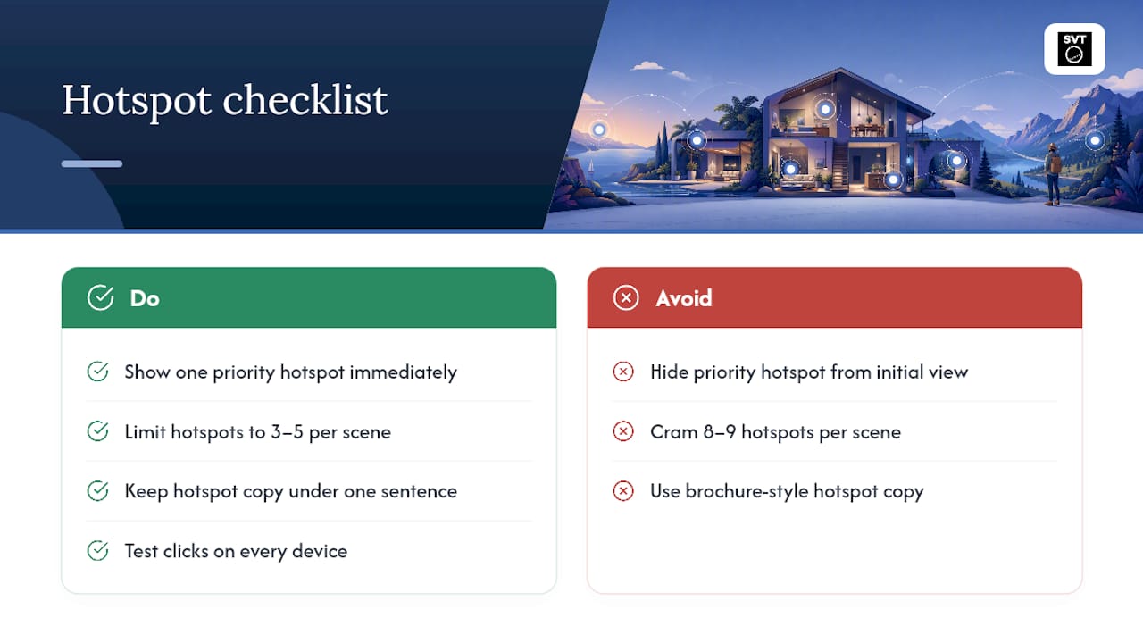
The three mistakes I see most often: burying the important hotspot outside the initial field of view, cramming eight or nine hotspots into one scene out of enthusiasm, and writing hotspot copy like a brochure instead of a label. Fix those three and you've solved most of what makes tours feel cluttered or confusing.
The checklist that matters right now: one priority hotspot in the first three seconds, three to five hotspots total per scene, two-way navigation links, copy under a sentence, and a click on every device before you publish. Test it, measure it, and let the data prune what doesn't work. Build it inside Simple Virtual Tour and you already have the tools to do all five.
— Andrea
Where Does Simple Virtual Tour Fit Into This Checklist?
The software provides a streamlined way to implement virtual tours with features including unlimited interactive tours under one plan, live session hosting, e-commerce integration, and options for cloud-hosted or self-hosted deployment to suit different data control and cost needs.
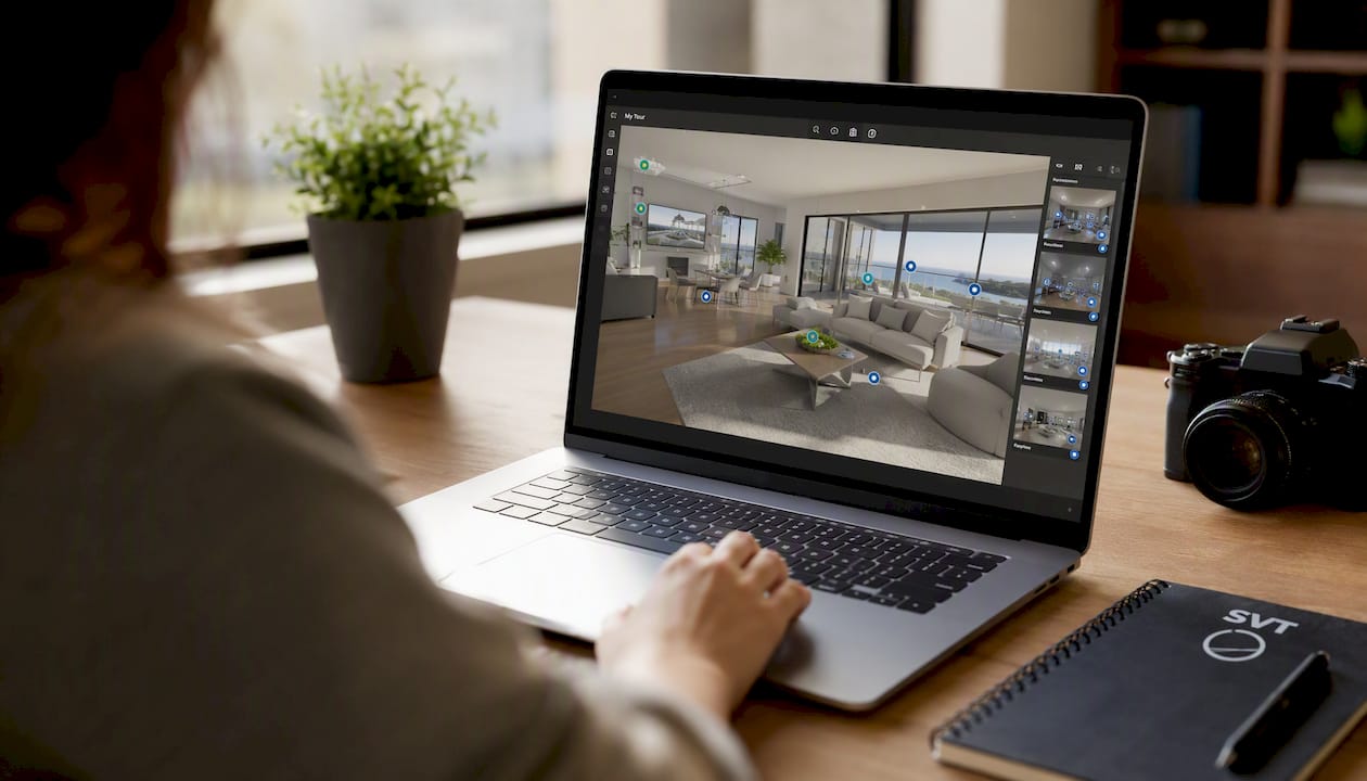
The backend supports custom icons, branded colors, and two-way navigation links, accessible through an interface designed for users without development expertise.
- Unlimited tours under one account
- Self-hosted or cloud deployment options
- Live session hosting for guided walkthroughs
- E-commerce and API features to support advanced hotspot workflows
Start with the free trial on Simple Virtual Tour's main page to build your first scene, or head straight to the pricing and purchase page if you're ready to set up your first tour this week.
Sources
- Interactive Hotspots in Virtual Tours: Best Practices Guide
- How to Create a Virtual 360° Tour (Step-by-Step)
- The Mount Vernon virtual tour