

The most common e-learning design mistakes share one root cause: courses built around information transfer rather than performance change. Whether you're dealing with bloated content, passive assessments, or inaccessible visuals, each flaw reduces the chance that learners will actually do something different after completing your course. The fixes are specific and testable. Run this quick audit on your most important course before you build anything new.
Top mistakes and one-line fixes:
- Unclear objectives: Rewrite each objective as a measurable job action, not a knowledge statement.
- Content bloat: Cut every "nice-to-know" slide; keep only what changes behavior.
- Passive "teach then test" design: Replace recall quizzes with scenario-based practice tied to real tasks.
- Aimless interactivity: Ask whether each interaction requires a decision; remove it if it doesn't.
- Distracting visuals: Apply WCAG contrast minimums and strip decorative animations.
- Weak engagement and practice: Add spaced retrieval checks and at least one peer-review activity.
- Accessibility and QA gaps: Test captions, keyboard navigation, and mobile rendering before launch.
Key Takeaways
Fixing common e-learning design mistakes starts with three high-impact actions: align objectives to job performance, cut content to need-to-know only, and replace recall quizzes with scenario-based practice.
| Point | Details |
|---|---|
| Objectives first | Rewrite every objective as a measurable job action before touching content or assessments. |
| Cut content aggressively | Apply the need-to-know filter; keep modules to 15–20 minutes of active learning time. |
| Replace recall quizzes | Add at least one scenario-based or performance-based assessment per learning objective. |
| Run the 30–60 min audit | Use the stepwise audit to find and prioritize fixes in a single session this week. |
| Simple Virtual Tour | Use Simple Virtual Tour to build interactive, accessible scenario environments that replace passive slide-based content. |
Table of Contents
- 1. Your learning objectives don't connect to job performance
- 2. Content bloat is burying your learners
- 3. Passive design and weak assessments trap you in the "teach then test" cycle
- 4. Your interactions require clicks, not thinking
- 5. Flashy visuals and inconsistent UX are costing you attention
- 6. Engagement and deliberate practice don't happen by accident
- 7. Accessibility and quality assurance are not optional finishing steps
- 8. Research-backed principles that prevent these mistakes
- 9. How to run a 30–60 minute course audit
- 10. Poor navigation and locked-down course flows frustrate learners
- 11. Ignoring learner diversity and prior knowledge creates a one-size-fits-all failure
- 12. Mobile responsiveness is not a nice-to-have feature
- 13. Courses without feedback loops don't improve
- What the evidence actually says about fixing e-learning design
- Simple Virtual Tour for interactive, accessible learning content
- Sources
1. Your learning objectives don't connect to job performance
Disconnected objectives are the single most upstream mistake in online course design. When an objective reads "Learners will understand the importance of data privacy," it describes a mental state, not a job action. Nobody can measure it, and no assessment can honestly test it. The Learning Guild identifies this "teach then test" fallacy as a core design error: objectives must tie directly to job performance and organizational KPIs, or the course is built on a false premise from the start.
Before: "Learners will understand the importance of data privacy." After: "Learners will correctly classify a customer record as PII or non-PII in three out of three scenarios."
To audit your objectives, ask three questions: Can a manager observe this behavior on the job? Does your final assessment actually measure it? Would your business stakeholder recognize it as a real performance gap? If any answer is no, rewrite the objective before touching the content.
Pro Tip: Map each objective to one assessment item and one business KPI in a single spreadsheet row. If you can't fill all three columns, the objective isn't ready.
2. Content bloat is burying your learners
Excess content is one of the most persistent e-learning design pitfalls, and it's usually well-intentioned. Subject matter experts want to share everything they know. The result is a course that violates what Mayer's multimedia learning principles call the coherence principle: adding irrelevant material actively harms retention by consuming limited working memory. The Learning Rooms describe courses that treat e-learning like an eBook as one of the field's deadliest sins.
Use this filter for every content item:
- Need-to-know: Directly enables the target performance. Keep it.
- Nice-to-know: Interesting context that doesn't change behavior. Cut it or move it to a supplemental resource.
- Irrelevant: Background that serves the SME's comfort, not the learner's need. Delete it.
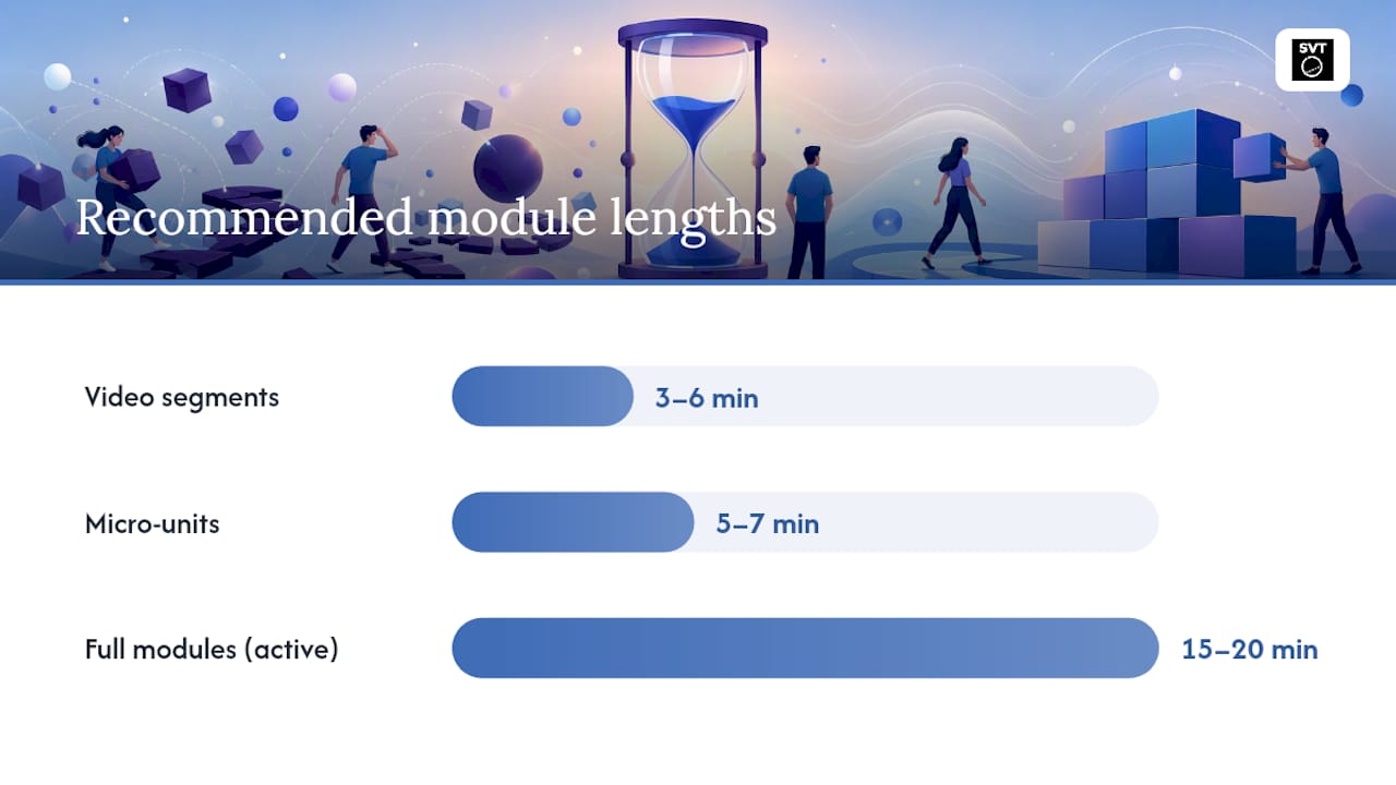
For module length, keep individual video segments to 3–6 minutes and full modules to 15–20 minutes of active learning time. An Illinois Law Review analysis of online teaching found that over-long recorded lectures and poor organization were among the most common learner complaints. Convert long modules into micro-units of 5–7 minutes each, with one learning objective per unit.
Pro Tip: Take your longest module and split it at every natural topic boundary. Each chunk becomes a standalone micro-unit with its own objective and a single knowledge check at the end.
3. Passive design and weak assessments trap you in the "teach then test" cycle
Passive exposure followed by a multiple-choice quiz is the default structure for most online courses, and it's also the structure least likely to produce behavior change. iSpring notes that simple click-to-advance interactions don't engage higher-order thinking, and the same logic applies to recall-focused quizzes: recognizing a correct answer in a low-stakes test is not the same as applying a skill under realistic conditions.
Replace passive design with these patterns:
- Scenario-based practice: Present a realistic job situation and ask learners to make a decision with consequences. Build at least one scenario per learning objective.
- Spaced retrieval checks: Add three brief retrieval prompts distributed across the course (not just at the end) to strengthen memory consolidation.
- Branching simulations: Let learners experience the downstream effects of wrong choices before they face them on the job.
- Performance-based final assessments: Replace end-of-course quizzes with tasks that mirror actual job steps, such as completing a form, classifying a case, or responding to a simulated customer.
To implement: map each objective to one of these patterns in your design document before opening your authoring tool. Build the assessment first, then design the instruction that prepares learners to pass it.
4. Your interactions require clicks, not thinking
Clicking "Next" is not interaction. Neither is clicking a hotspot that reveals a text definition. Articulate's community roundup of common e-learning mistakes consistently flags poor interactivity as one of the top recurring errors, and the fix is straightforward: every interaction must require cognitive processing to improve learning.
Ask these questions before keeping any interaction:
- Does this require the learner to make a judgment or decision?
- Is the feedback specific to the choice made, not just "Correct" or "Try again"?
- Would removing this interaction reduce learning, or just reduce clicks?
Bad interaction: Click each term to reveal its definition. Good interaction: A customer complaint arrives. Choose the response that follows the escalation policy, and see the consequence of each choice play out.
Pro Tip: When designing branching choices, write the wrong-answer consequence before the correct-answer path. Knowing what failure looks like makes the correct path more meaningful and the feedback more specific.
5. Flashy visuals and inconsistent UX are costing you attention
Visual design that prioritizes aesthetics over function adds extraneous cognitive load, which Mayer's multimedia learning research shows directly reduces meaningful learning. Decorative animations, mismatched fonts, and low-contrast text all compete with the instructional content for limited working memory. TransPerfect's analysis of e-learning pitfalls specifically calls out repurposed marketing aesthetics as a common source of visual noise in courses.
Practical visual guidelines:
- Contrast: Text must meet the WCAG 2.2 minimum contrast ratio of 4.5:1 for normal text. Use a tool like WebAIM's Contrast Checker to verify every slide template.
- Hierarchy: Limit each screen to one primary message. Use size and weight, not color alone, to signal importance.
- Whitespace: Resist the urge to fill every pixel. Empty space reduces visual competition and improves focus.
- Animations: Use motion only when it illustrates a process. Remove all decorative transitions.
Three quick usability tests: (1) Can a new learner identify the main point of a screen within five seconds? (2) Does the course render cleanly on a phone screen? (3) Do captions match the audio at a comfortable reading pace?
6. Engagement and deliberate practice don't happen by accident
Engagement is not a feature you add at the end; it's a structural decision you make at the design stage. The highest-impact engagement tactics are those that require learners to produce something, not just consume it. WorkAI's analysis of common e-learning mistakes highlights the failure to treat e-learning as an ongoing product rather than a one-time launch, and that mindset shift matters for engagement too.
Scalable engagement tactics:
- Peer review: Assign learners to evaluate one another's scenario responses against a shared rubric. This scales without adding reviewer workload.
- Moderated discussion forums: Post one discussion prompt per module with a clear response expectation. A facilitator reviews weekly, not daily.
- Coached practice: Provide a short performance checklist learners use to self-assess before submitting work.
- Virtual tour-based scenarios: Place learners inside a realistic environment to make decisions in context, which increases transfer.
Pro Tip: Design at least one "productive struggle" activity per course: a task slightly beyond the learner's current ability, with scaffolded hints rather than immediate answers. Struggle followed by resolution produces stronger retention than smooth, frictionless content.
7. Accessibility and quality assurance are not optional finishing steps
Accessibility and QA failures don't just create equity problems; they break the learning experience for a significant portion of your audience. The Learning Rooms cite ignoring inclusion as one of the most damaging design errors, and the fix starts with a structured checklist run before every launch.
QA and accessibility checklist:
- Audio levels are consistent across all media; no clipping or background noise.
- All video content has accurate, synchronized captions.
- Every hyperlink and button is tested and functional.
- Keyboard navigation works through all interactive elements without a mouse.
- Color contrast meets the WCAG 4.5:1 minimum for body text.
- Course renders correctly on at least two browsers and one mobile device.
- All images have descriptive alt text.
For cross-device testing, use a simple matrix: list your three most common learner devices (desktop, tablet, phone) across the top and your two primary browsers down the side. Test each cell before launch and log any failures with a priority rating (blocks learning vs. cosmetic). See the virtual tour accessibility setup guide for a practical example of how to structure accessibility checks for interactive media.
| Device | Chrome | Safari |
|---|---|---|
| Desktop | Test navigation, captions, contrast | Test navigation, captions, contrast |
| Tablet | Test touch targets, layout reflow | Test touch targets, layout reflow |
| Mobile | Test font size, scroll, media playback | Test font size, scroll, media playback |
8. Research-backed principles that prevent these mistakes
Three research anchors explain why the fixes above work.
Cognitive load theory (Sweller): Working memory is limited. Every extraneous element in a course competes with the instructional content. Reducing split-attention effects, eliminating redundant text-and-audio combinations, and segmenting content into smaller units all reduce extraneous load and free capacity for learning.
Mayer's multimedia learning principles: Aligned visuals and narration outperform text-heavy slides. The signaling principle (highlighting key information), the segmenting principle (learner-paced chunks), and the coherence principle (removing irrelevant material) are the three most directly applicable to fixing common design errors in e-learning.
Retrieval practice / testing effect (Roediger and Butler): Testing memory strengthens it more than re-reading does. Three spaced retrieval checks distributed across a module produce better long-term retention than a single end-of-course quiz.
Microprotocol examples you can paste into a design brief:
- Add three retrieval prompts per module, spaced at the beginning, middle, and end.
- Limit each practice simulation to 60–90 seconds of active decision-making.
- For every text-heavy screen, replace or pair the text with a functional visual that carries the same meaning.
Pro Tip: Turn these principles into acceptance criteria. Before sign-off, add three QA questions to your review template: Does this screen add extraneous load? Is there a retrieval check in the last 10 minutes? Does every visual carry instructional meaning?
9. How to run a 30–60 minute course audit
This audit finds the highest-priority fixes in a single focused session. Budget 30 minutes for a short course (under 30 minutes of seat time) and 60 minutes for a full module.
- 0–10 min: Objectives scan. Read every stated objective. Flag any that describe a mental state rather than an observable job action. Count how many map directly to an assessment item.
- 10–25 min: Content triage. Skim every screen. Mark each content item as need-to-know or nice-to-know. Flag any module exceeding 20 minutes of seat time.
- 25–40 min: Assessment check. Review every quiz question and interaction. Flag any that test recall only. Note whether scenario-based or performance-based items exist.
- 40–55 min: Accessibility and UX quick tests. Run the QA checklist from Section 7. Check contrast on three representative screens. Navigate the course using only a keyboard for two minutes.
- 55–60 min: Prioritize. Sort your flagged items into two columns: high impact / low effort (fix this week) and high impact / high effort (schedule for next sprint).
This session produces a short work backlog you can take directly into your next design sprint. eLearning Industry recommends treating courses as living products with ongoing roadmaps rather than one-time launches, and this audit is the first step in that cycle.
10. Poor navigation and locked-down course flows frustrate learners
Forcing learners through a linear sequence they cannot control is one of the most cited e-learning design pitfalls. Articulate's community analysis lists locked navigation as a recurring error that signals distrust of the learner and increases frustration without improving outcomes.
The fix is to unlock navigation for experienced learners while preserving sequence for genuinely prerequisite content. Allow learners to revisit completed sections freely. Use a course menu that shows progress without blocking access. Reserve locked sequences for branching scenarios where the order is instructionally necessary, not just administratively convenient. For complex multi-section courses, a clear visual map of the content structure reduces orientation time and cognitive overhead. See how navigation design works in complex interactive tours for a practical model of progressive disclosure in non-linear content.
11. Ignoring learner diversity and prior knowledge creates a one-size-fits-all failure
A course built for the average learner serves almost no one well. Novices need scaffolding and definitions; experienced learners need challenge and application. Treating every learner as if they start from zero wastes the time of your most capable people and loses your least experienced ones. WorkAI's review of common course-development pitfalls specifically flags one-size-fits-all content as a strategic planning failure.
Practical fixes: add a short pre-assessment (3–5 questions) that routes learners to the content level they actually need. Offer optional deep-dive resources for advanced learners without forcing them on everyone. Use branching to let learners self-select their experience level at the start of a module. For diverse audiences, tailoring content for varied learner profiles is a concrete way to address the range of prior knowledge without rebuilding the entire course.
12. Mobile responsiveness is not a nice-to-have feature
A course that breaks on a phone is a course that doesn't work for a large share of your learners. Responsive design means content reflows correctly at any screen size, touch targets are large enough to tap accurately, and media plays without requiring a plugin. Test every course on at least one iOS and one Android device before launch.
Specific checks: font size should be at least 16px for body text on mobile. Buttons and tap targets need a minimum of 44x44 pixels. Horizontal scrolling is a failure state, not a design choice. Video should autoplay only with captions on, and never with audio on by default. If your authoring tool produces fixed-width output, consider rebuilding templates in a responsive framework before your next course launch.
13. Courses without feedback loops don't improve
A course launched without a measurement plan is a guess that never gets corrected. Feedback mechanisms include learner satisfaction surveys, assessment performance data, completion rates, and post-training performance metrics tracked with managers. eLearning Industry emphasizes the product mindset: treat your course as a product with a roadmap, not a document you publish once.
Set a 30-day post-launch review as a calendar event at the time of launch. Review assessment pass rates, drop-off points, and any open-text survey responses. Identify the one screen or module with the highest failure or exit rate and fix it first. Building trust with learners through consistent communication about updates and improvements also increases re-engagement with revised content.
What the evidence actually says about fixing e-learning design
The conventional wisdom in instructional design circles is that more content equals more learning. It doesn't. The research is clear: cognitive load theory, Mayer's multimedia principles, and retrieval practice evidence all point in the same direction. Less content, more practice, and aligned feedback produce better outcomes than comprehensive coverage.
What most designers underestimate is how much the order of operations matters. The mistake isn't usually in the content itself; it's in building content before building the assessment. When you write the quiz first, every content decision becomes a filter: does this screen prepare the learner to pass that task? If not, it doesn't belong in the course.
The other overlooked issue is that accessibility is not a compliance checkbox. A course that fails WCAG contrast minimums or lacks captions isn't just legally risky; it's a course that a portion of your learners simply cannot use. That's a design failure, not an edge case.
Start with the 30-minute audit. Fix objectives first, then prune content, then replace at least one recall quiz with a scenario. Those three steps alone will improve most courses more than any visual redesign.
Simple Virtual Tour for interactive, accessible learning content
If your courses rely on static slides and passive media, Simple Virtual Tour offers a direct alternative. The platform lets you build unlimited interactive virtual tours with 360° panoramas, embedded hotspots, and branching navigation, giving learners an environment where they make decisions in context rather than clicking through screens. Live session capabilities support real-time coached practice, and the multilingual interface makes it accessible to diverse learner groups without rebuilding content from scratch.
Simple Virtual Tour works on both cloud-hosted and self-hosted deployments, so your organization keeps control of learner data and avoids ongoing vendor lock-in. The accessibility features are built in, not bolted on, which means you spend less time retrofitting compliance and more time designing practice. With over 1,400 current users across education, real estate, and tourism, the platform is proven in production environments that demand both usability and depth.
Start a free trial at Simple Virtual Tour and run your next scenario-based module in an environment learners can actually navigate.

Sources
- 5 Learning Design Mistakes That Hinder Success (& How to Fix Them) - Learning Guild
- The 5 biggest mistakes in designing eLearning - iSpring Solutions
- eLearning design: seven deadly sins - The Learning Rooms
- Multimedia Learning (3rd ed.) — Cambridge University Press